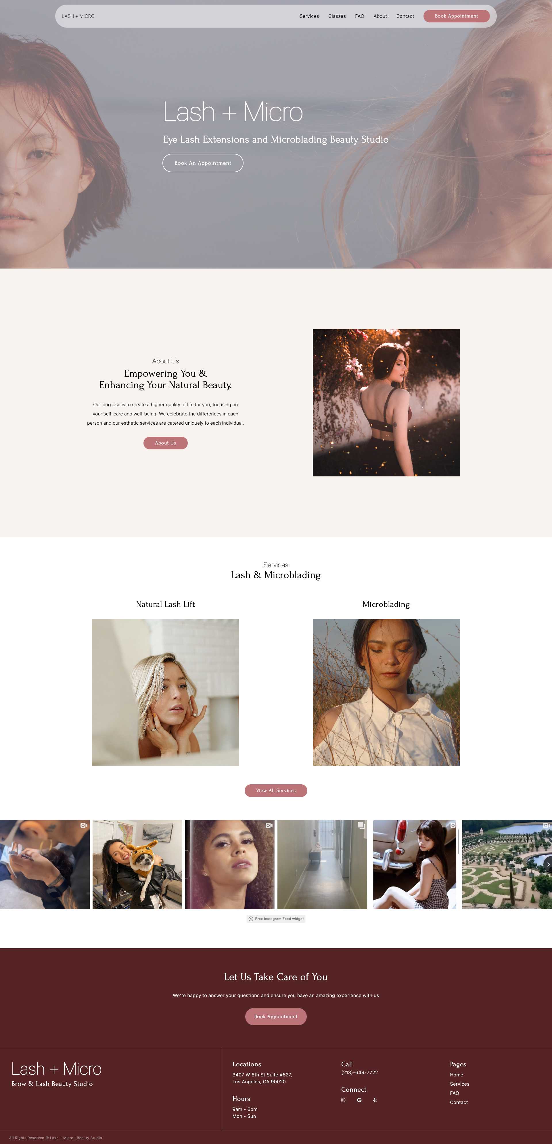
Lash + Micro
A website built to grow the online presence of an beauty studio based in Los Angeles
The Challenge
The client's page layout was dated, sparse with information, and lacked clarity in what the business does, which services are provided, and how to reach the business for appointments
The Solution
Update the layout to make the CTAs more prominent, focusing more on usability while also making some stylistic changes to improve the appearance as being more of a professional establishment
The Outcome

